Furniture 101: Prim Saving

Even though mesh has greatly reduced the need to cut prims by lowering land impact to a bare minimum, there’s still prim saving to be done. If you guys are anything like me, more prims to use means more stuff to drop! So, that just means you end up in the same dilemma as you did before mesh rolled around.

I have a few tricks to help you guys save prims, so you can either drop more of your goodies because you have more space, or pay less for your rent because you don’t need as much.

Linking

Linking stuff together is the easiest way to cut down on your land impact. While it makes changing things in the future a little (and I mean just a little) more difficult, it’s the quickest way to give yourself more space.

Here is an example from my own home.

Furniture 101: Prim Saving

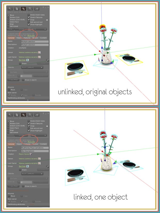
The original table set up, unlinked, totaled 16 LI. Alone, the flowers are 10 LI, and each place setting is 3 LI. Because none of them are scripted, and they are in close proximity to each other in terms of decorating, linking them is a safe route to go.

Linked together, the set is reduced to 11 LI, cutting the set down by 5 prims, which either means you have room for more stuff, like place mats, or you can reduce how much you’re renting.

Resizing

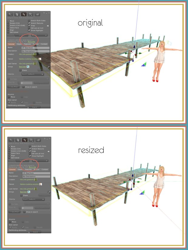
One of the drawbacks of mesh (at least to me) is the fact that making an object bigger also raises the land impact. This can also be a good thing, because it works in reverse as well.

Resizing objects is am easy way to reduce land impact when objects are bigger than you need them to be. While not nearly as effective as linking, it’s a good trick if you’re desperate for more space.

f101 - prim saving

This is a good route to go if something is, as I said above, bigger than you need it. Also, it’s best to use this with unscripted items, especially something without animations. More often than not, you will need to readjust all the animations if you resize something.

Replacing

Mesh has come a long way in two years. Designers have gotten better at what they do, and are able to use their own tricks to reduce land impact before you even get a hold of their stuff.

Try replacing some of your first mesh items with new releases. Chances are, not only with the detail, texturing, and overall construction be better, but the land impact will most likely be lower as well.

—–

Just remember that every little bit helps! One prim here and two prims there can add up to a whole bunch, and before you know it, you have a lot more space than you thought you did.
Photography 101: Crop Shop

One simple, easy way to take better pictures without buying a new computer to up your graphics, or spend time learning the ins and outs of Photoshop, is to learn how to crop things in a more visually pleasing way.

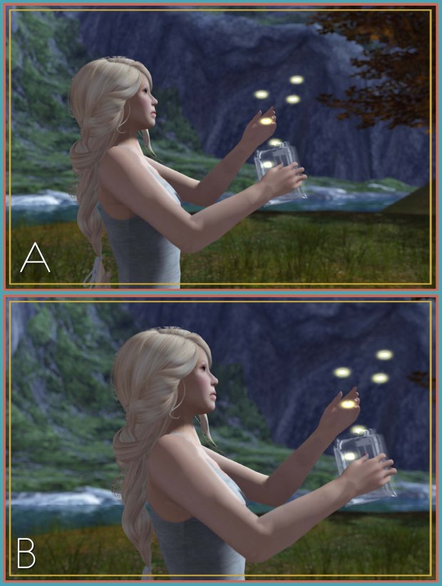
In all these examples, A is the more aesthetically pleasing way, while B shows the difference when the guideline isn’t exactly followed.

Rule of Thirds:

Chances are, you subscribe to the rule of thirds without even knowing it. The rule of thirds basically suggests that, while imagining your image divided into 9 equal portions, it will be more powerful and dynamic when key points of the composition are placed along these lines and intersections.

To create 9 equal squares, simply hit ctrl-shift-R on your keyboard while in Photoshop. This will cause a ruler to appear, and now all you have to do is divide the numbers into equal parts.

Lead Room:

Everyone loves those looking-into-the-distance pictures, but it helps if you actually have distance to look longingly into. Lead room is the space in front, and in the direction, of moving or stationary subjects

This is used because if extra space is allowed in front of the subject, the viewer can see that it has someplace to go; without this visual padding, the subject’s forward progress will seem impeded

Body Cropping:

While this won’t be found online anywhere, it’s something I learned as I worked as a photographer. In layman’s terms, cropping off a hand is like cutting it off.

When cropping around a body, never, ever crop through a joint, especially hands and feet. Instead, select a segment in between two joints, like a thigh, calf, or forearm.

While these guidelines are not rules, they do make your photography look clean and polished. Just remember that you can’t covered up poor composition with any amount of post editing!

Photography 101: Pot of Gold

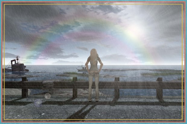
After my last tutorial, I figured I’d show you how I created the rainbow I used in the final picture. It’s super simple, and doesn’t require any addons like new brushes or junk like that.

1. Make a new layer

After you’ve opened your picture in whatever Photoshop you use (I’m out of date and use 7) go up to the toolbar and create another layer.

2. Open the gradient bar

Click the gradient tool, and make sure radial version is selected (the round one) and pick the transparent rainbow style. That’s the rainbow bordered by alphas.

3. Create your new gradient

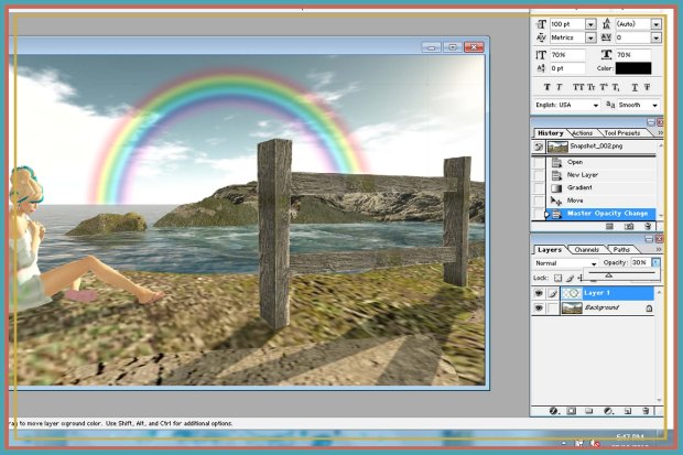
Now, here comes the tricky part. You’ll have to move the coloured arrows and replicate the gradient in the picture above. Once you have one you’re happy with (make sure to test it out), create your rainbow circle while making sure it doesn’t clip on the edges.

4. Position and erase

After you’ve moved your rainbow to where you want it, big a feathered (soft) brush to erase appropriate areas. Next, move over to the opacity option in the layers box, and set it to where you think looks good. I’ve set it to 30% here.

5. Make it pretty!

Add whatever effects to make your shit look good. Lens flare is always a good standby!

Photography 101: Singin’ In The Rain

Rain is ugly in SL. Let’s face it. No matter how hard people try, rain particles and emitters never look quite good enough in photography for my taste.

This is a simple 5 step guide on how to create rain with nothing but Photoshop! That’s right, no brushes and it’s incredibly easy. I mean, if I can do it, anyone can do it.

1. Make a new layer

After you’ve opened your picture in whatever Photoshop you use (I’m out of date and use 7) go up to the toolbar and create another layer.

2. Fill and screen

From now on, we’ll be working with the new layer. Leave the background alone! In that new layer (make sure it’s the new layer and not your picture) auto-fill it with black and set the layer type to screen.

3. Add noise

Go up to the filter tab and to the noise option. Click add noise, and in the window that pops up, fiddle with your settings, though make sure the monochromatic box is ticked, otherwise your rain will be coloured. The amount of noise you do dictates how fat and distinct your rain will be.

4. Blur that shit!

In the filter tab again, this time go to the blur option, and pick motion blur. In the window, fiddle with the settings again. The angle is the direction of the rain, and the distance of the pixels is how long the raindrops will be,

5. Adjust the levels

Last step! Go to the images tab and under the adjustments option, pick levels. In the window, move the black arrow (one furthest to the left out of the three) to about the middle of the bulge. This simply makes the rain stand out more.

6. Make it pretty

After you’ve added your rain, do whatever other effects you want to; have fun with it!